Frankston Family Chiropractic Brand Identity & Website Design
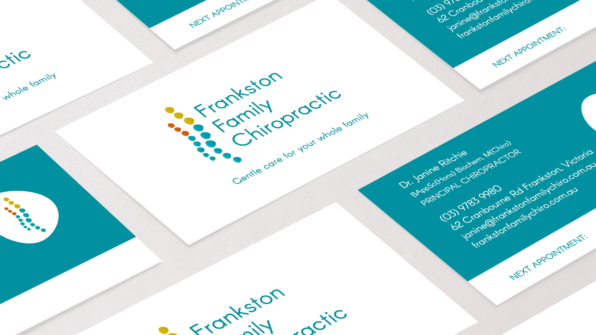
The brand identity for Frankston Family Chiropractic is bright, fresh and family friendly. The logo represents the spine of an adult and child. My client was drawn to the colour teal, which suited their Bayside location perfectly, while the orange and mustard colours provide contrast and interest.
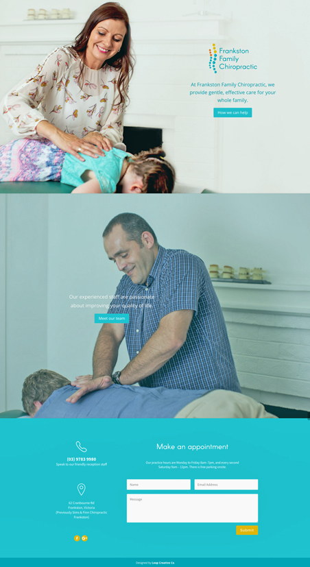
The responsive website design also incorporates this colour scheme. The site is easy to navigate and provides information on chiropractic care in a way that is reassuring and accessible. Features include a contact form in the footer to provide potential clients with easy access to contact details, a FAQ page, social media links and mobile/tablet-friendly functionality.


