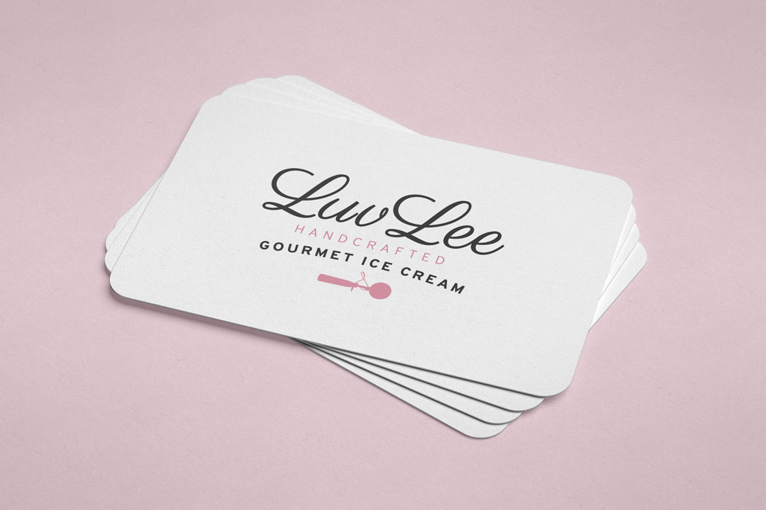
Luv Lee Gourmet Ice Cream Brand Identity
The brand name features a classic, feminine, script font style, alongside a contrasting, modern, sans serif font for the tag line. The uppercase ‘handcrafted’ works to emphasise the brand’s unique selling point. The icecream scoop icon is a reference to the personal history that inspired the business. The typography, icon, and colours are fitting for the feminine, vintage inspired brand identity.